For my UI/UX design class, I created a complete UI and UX concept for a sci-fi / space simulation game. The project includes 10 user interface screens designed entirely by me in Figma, a UX wireframe prepared in Whimsical, and a brief description of the main design assumptions.
1. Description
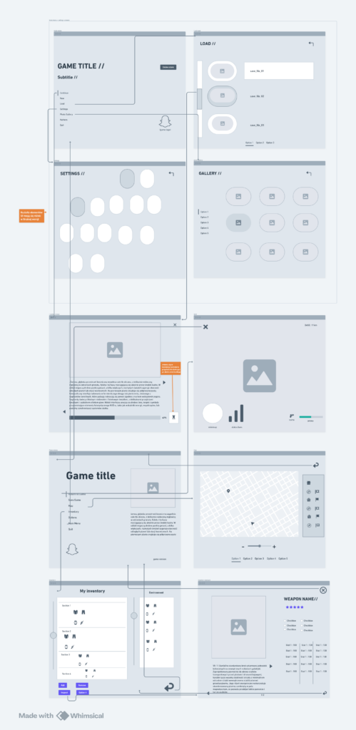
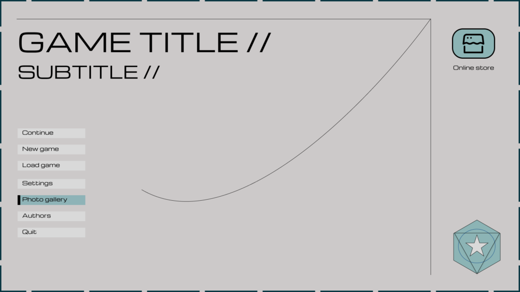
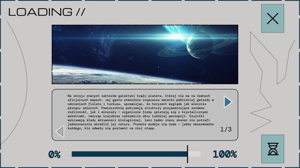
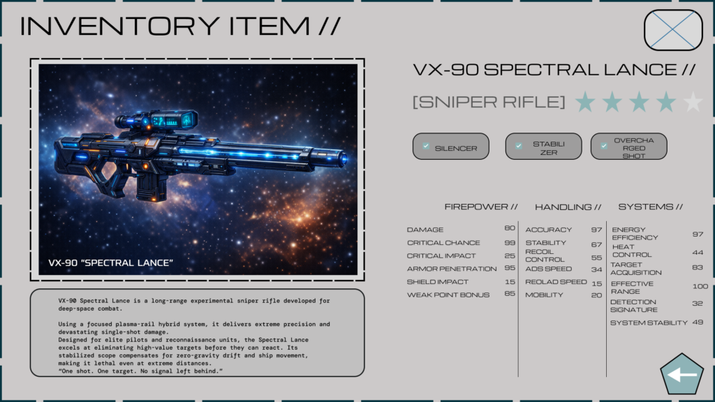
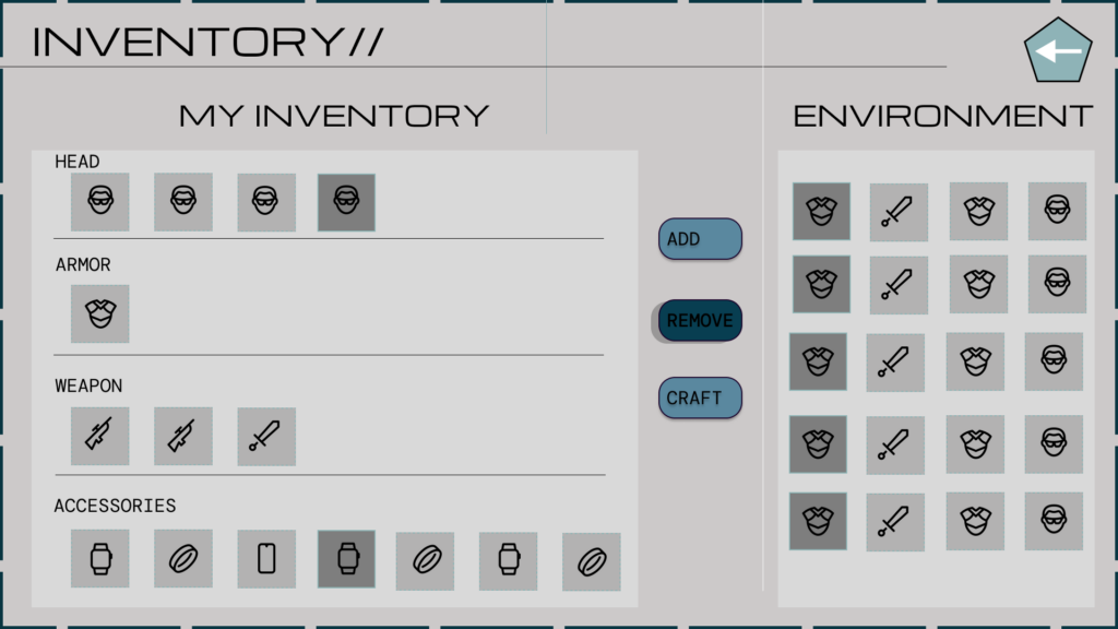
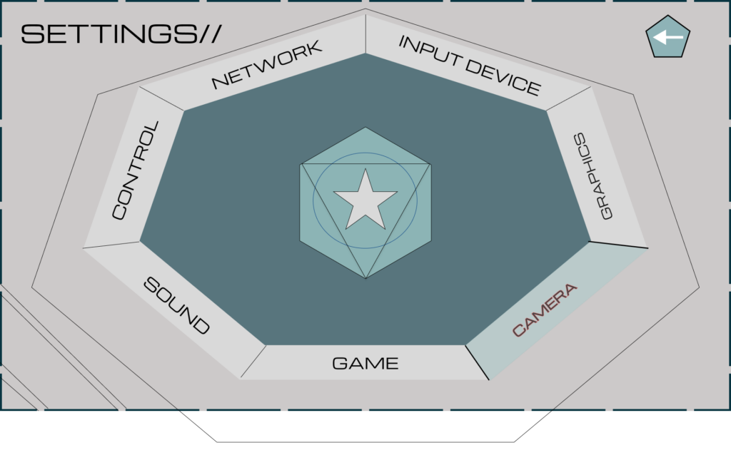
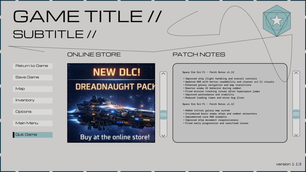
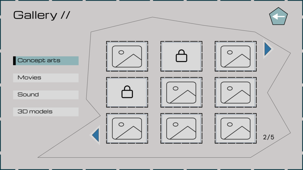
The UI/UX project presents a set of 10 screens for a sci-fi RPG / SpaceSim game, designed with clarity, consistency, and immersion in mind. The main visual and functional inspirations include titles such as Starfield, Elite Dangerous, Armored Core VI, and Death Stranding, which helped define the stylistic direction of the project. The interface is maintained in a minimalist, futuristic style, with a color palette primarily limited to shades of gray, complemented by turquoise and light-blue accents. This color combination gives the UI a cool, technological character while preserving high readability even when displaying large amounts of information.
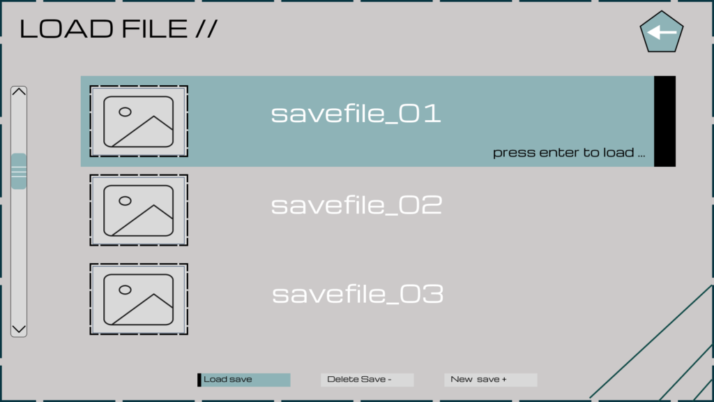
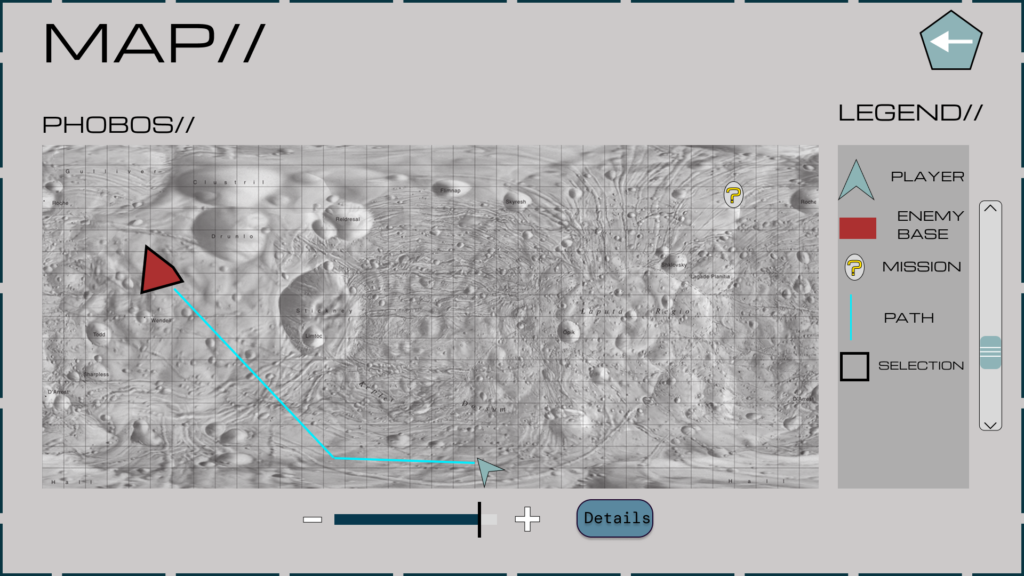
The project incorporates non-standard geometric forms such as hexagons, octagons, and curved lines, giving the interface a unique and recognizable style. Moving away from classic rectangular layouts emphasizes the futuristic nature of the game and strengthens its visual identity. Across the presented screens, users can navigate from the main menu to sections such as Settings, loading saved game states, or a photo gallery, all while maintaining intuitive navigation. Each screen allows seamless return to the main menu or transition to other functionally related screens.
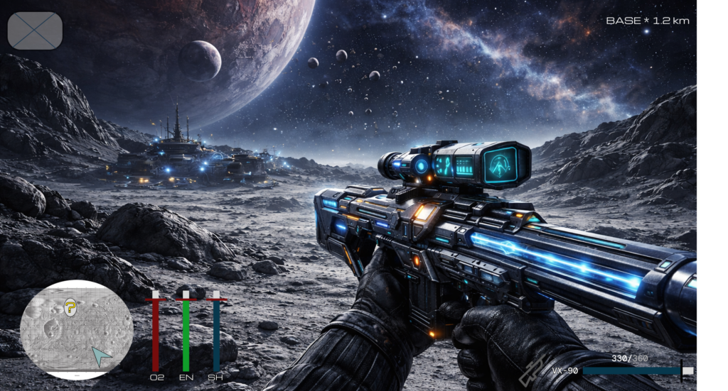
The interface also enables browsing the in-game world map and the player’s inventory, ensuring quick access to key information and gameplay functions. The target audience consists of midcore and hardcore players interested in sci-fi aesthetics, futurism, and interfaces that combine simplicity with an advanced, immersive atmosphere.
2. UX wireframe
3. UI Screens
0 Comments